Identifying and labeling boxplot outliers in R
Boxplots provide a useful visualization of the distribution of your data. Typically, boxplots show the median, first quartile, third quartile, maximum datapoint, and minimum datapoint for a dataset. Many boxplots also visualize outliers, however, they don't indicate at glance which participant or datapoint is your outlier.
Labeling your boxplot outliers is straightforward using the ggstatsplot package, here's a quick tutorial on how to do this.
Let's first install and load our required packages. First, we'll need the tidyverse package as it comes with a dataset of Star Wars character attributes that I'll be using and we'll need to clean a dataset a little. Second, we're going to load the ggstatsplot to construct boxplots and tag outliers.
In humans, males are typically taller than females, but what about males and females in the Star Wars universe, which is inhabited by thousands of different species? Let's take a look in our dataset.
Let's clean up our dataset for the purposes of this demonstration by only including males and females as there's a single hermaphrodite in the dataset—it's Jabba the Hutt, if you're wondering.

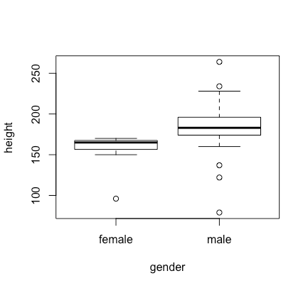
To clean our dataset, we're using the "filter" function from the dplyr package, which comes with the tidyverse package. We'll also construct a standard boxplot using base R.
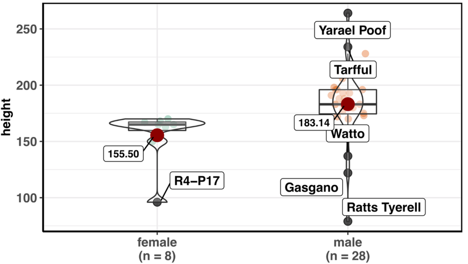
Here's our base R boxplot, which has identified one outlier in the female group, and five outliers in the male group—but who are these outliers?
We can identify and label these outliers by using the ggbetweenstats function in the ggstatsplot package.
To label outliers, we're specifying the outlier.tagging argument as "TRUE" and we're specifying which variable to use to label each outlier with the outlier.label argument.
Here's our plot with labeled outliers. A great feature of the ggstatsplot package is that it also reports the result of the statistical test comparing these two groups at the top of the plot. Males were significantly taller than females in this dataset.
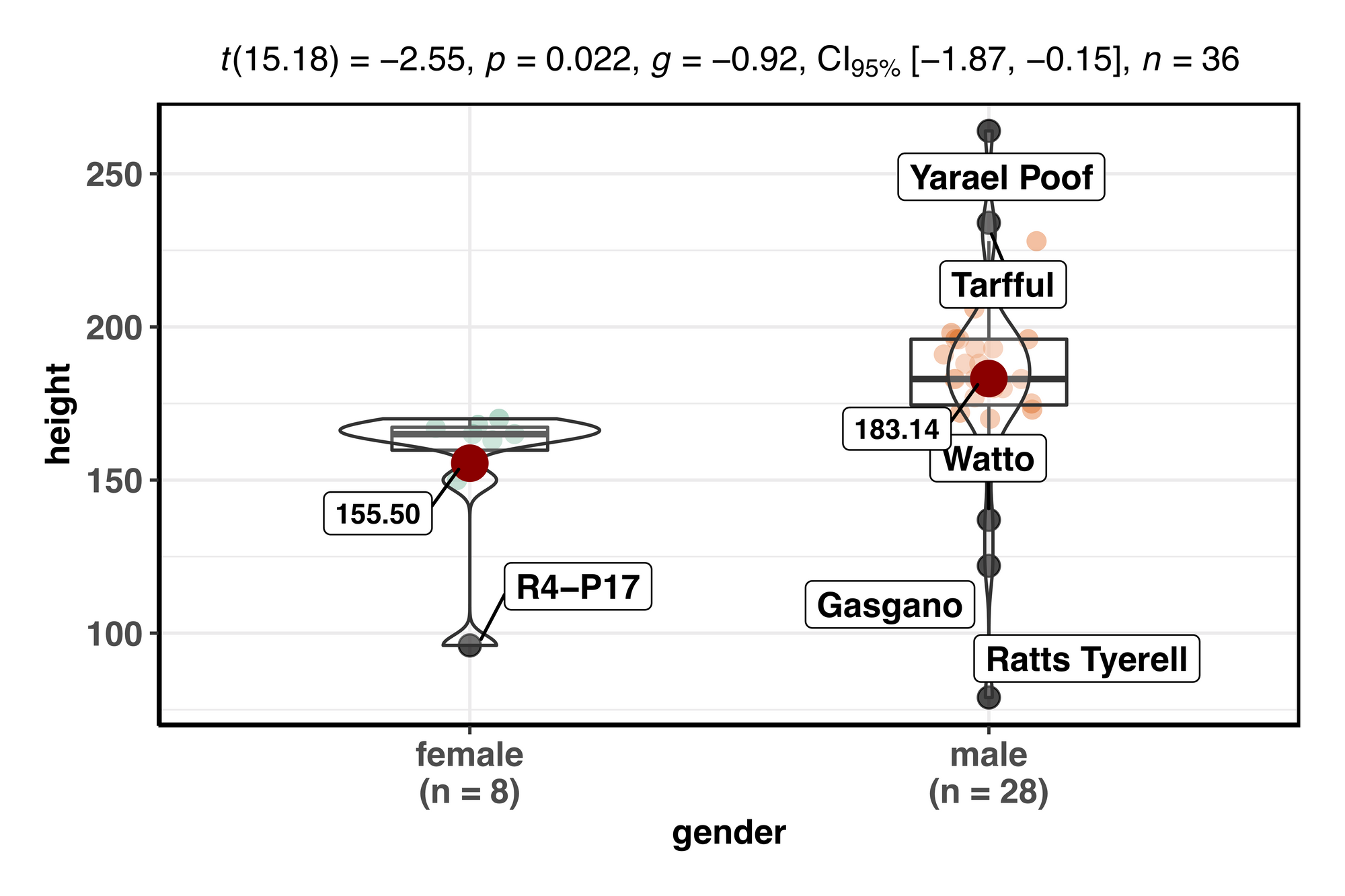
By default, the ggstatsplot package also identifies and labels the group means (the red dots), which is typically of interest but seldom included in conventional boxplots.
Here's the full R script for this tutorial, all in one place.