Equivalence-enhanced forest plots with power tiles for meta-analysis

Unlike primary research, most meta-analysis articles provide enough information to recreate their results. This information tends to be reported in forest plots, which provide a summary of the extracted effect size from each study, along with some measure of variance, like standard error or a confidence interval.
As well as facilitating the verification of the results, this easily extractable information also provides the opportunity for the reanalysis of data.
Some meta-analyses report a non-significant summary effect size and conclude that there is no effect. However, a non-significant result only means that you failed to reject the null hypothesis, not that there was support for the null hypothesis. However, equivalence tests make it possible to reject of effects as large, or larger, than a smallest effect size of interest. For instance, if you believe that an effect of d = 0.2 or smaller is practically meaningless, then you can perform an equivalence test to reject effects that are as large, or larger, than d = 0.2. If the result of this test is statistically significant, then you could conclude that the effect was statistically equivalent.
Equivalence tests are becoming popular in primary research studies, but I've yet to see one "out in the wild" for a meta-analysis. Fortunately, Daniel Lakens' TOSTER R package provides a function for performing equivalence tests for meta-analytic results.
Let's run a test on a meta-analysis with a summary effect size of 0.07 and a standard error of 0.0918. We'll set our equivalence bounds at 0.2.
library(TOSTER)

TOSTmeta(ES = 0.07,
se =  0.0918,
low_eqbound_d = -0.2,
high_eqbound_d = 0.2)
Running this test yields a figure like this.
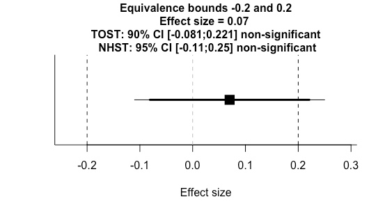
We can see at a glance that the null hypothesis significance test (NHST) was not significant because the 95% confidence interval (thin line) crossed zero. Additionally, we can see the two one sided test (TOST) for equivalence (thick line) was not significant as one of the 90% confidence bounds crossed our equivalence threshold. This is a useful plot, but there's no straightforward way to visualise a series of tests with various equivalence bounds.
There are two reasons you might want to combine a series of tests. First, you might have several meta-analysis results from a single paper you would like to combine into a single figure. Second, you might want to combine results from different papers that address similar research questions.
I'm working on a project that's addressing the second question. I couldn't find a good solution for visualising equivalence tests for a series of summary effect sizes, so I made my own R function, which you can access on my Github repository.
So now we're going to run a function to analyse the data (also available on my Github repository).
leppanen_2017_1_results <- ma_pipe_sei(
  "dat_leppanen_2017_1.csv", # Load data
  true_effect = 0.09, # Reported effect size
  rep_lower = -0.06, # Reported lower bound
  rep_upper = 0.24, # Reported upper bound
  analysis_title = "Leppanen_2017_1", # Title of analysis
  plot = TRUE
)

leppanen_2017_1_et_dat <- leppanen_2017_1_results$et # Extract equivalence test results
The funtion ma_pipe_sei takes the extracted data of a meta-analysis, and has to include two columns: "yi" with effect size data, "lower" with the lower confidence interval bound, and "upper" with the upper confidence interval bound.
This function calculates the standard error for each study effect based on the upper and lower confidence interval bounds. It performs meta-analysis, outputs the data, creates a sunset plot, performs an equivalence test, and visualises the equivalence test. We can extract these outputs one-by-one into new objects.
leppanen_2017_1_res <- leppanen_2017_1_results$res # Meta-analysis results

leppanen_2017_1_data <- leppanen_2017_1_results$dat # Meta-analysis raw data

leppanen_2017_1_sunset <- leppanen_2017_1_results$sunset # Meta-analysis sunset plot

leppanen_2017_1_et_plot <- leppanen_2017_1_results$et_plot # Extract equivalence test results

leppanen_2017_1_et_dat <- leppanen_2017_1_results$et # Extract equivalence test results
Now we just repeat this for other meta-analysis datasets (see my Github repository for additional example data and analysis scripts).
Now we can combine the results and create our plot.
com1 <- rbind(leppanen_2017_1_et_dat,
              leppanen_2017_2_et_dat,
              leppanen_2017_3_et_dat,
              leppanen_2017_4_et_dat,
              leppanen_2017_5_et_dat,
              leppanen_2017_6_et_dat)

com1 <- combine_et(com1)

com1 <- com1 + ggtitle("Summary effect sizes and equivalence bounds") +
  theme(plot.title = element_text(hjust = 0.5))
This uses the combine_et() function, that's also in my script. Here, you just need to input a dataset that contains all the equivalence test results you would like to include. I've also added a title to the figure.
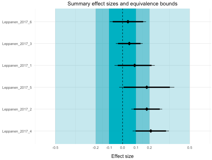
In this plot, I've visualised three equivalence test bounds: 0.1, 0.2, 0.5. You can also see the 95% NHST confidence intervals (thin lines) and the 90% TOST confidence intervals for each meta-analysis. If you would consider effects smaller than 0.2 to be practically unimportant, the first two meta-analyses demonstrate equivalent effects.
The second complementary visualisation that I've created, which I've called power tiles, illustrates the median statistical power of each study that was included in the meta-analysis. A meta-analysis that is comprised of studies with low statistical power is less credible than one that includes studies with high power. To create this function, I've adapted code from the 'metaviz' R package.
One element of this power analysis is that you need enter the "true" effect size for this calculation. As this is difficult in practice, I've included three options: The summary effect size calculated from the meta-analysis, an effect size of 0.33, and an effect size of 0.66. Here's the script you need to run, which will also combine the power tile plot with our equivalence-enhanced forest plot.
power_med <- rbind(leppanen_2017_1_power_median_dat,
                   leppanen_2017_2_power_median_dat,
                   leppanen_2017_3_power_median_dat,
                   leppanen_2017_4_power_median_dat,
                   leppanen_2017_5_power_median_dat,
                   leppanen_2017_6_power_median_dat)

power_med_long <- gather(power_med, effect, power, observed:e66, factor_key=TRUE)

tile <- ggplot(data = power_med_long, aes(x = effect, y = reorder(analysis, -ES),)) +
  geom_tile(aes(fill = power)) +
  coord_equal(ratio = 0.8) +
  scale_fill_gradient(name = "Power", low = "#FDF0FF", high = "#E200FD") + theme_tufte(base_family="Helvetica")

tile <- tile + theme(axis.text.y = element_blank(),
                     axis.ticks.y = element_blank(),
                     axis.title.y = element_blank())

tile <- tile + ggtitle("Median statistical power") +
  xlab("Effect size") +
  theme(plot.title = element_text(hjust = 0.5))

tile <- tile + scale_x_discrete(labels=c("observed" = "Observed \n effect", "e33" = "0.33",
                                         "e66" = "0.66"))
tile

# Combine the two plots
com1 + tile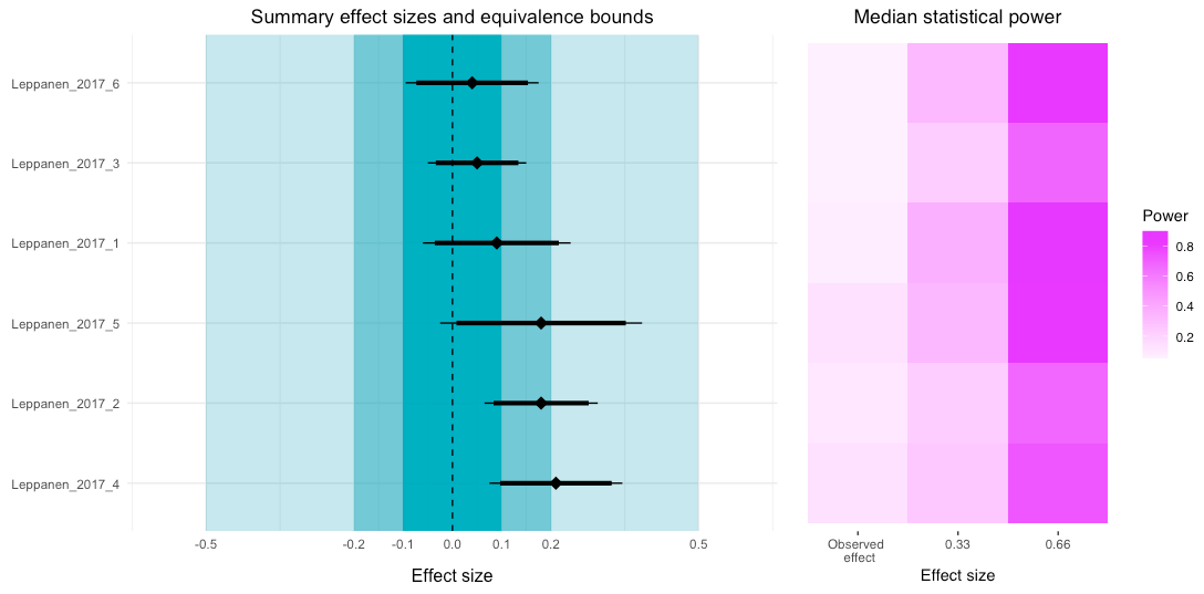
Looking at the power tile plot, we can see that for the observed effects the median power was very low. However, if the true effect size was higher, then the power for each study (or to be more precise, the tests reported in the study) would be sufficient.
The code is a little messy, but I wanted to share an early version to get some feedback. Please let me know if you have any suggestions on how I can improve these visualisations.