How to identify and deal with outliers in meta-analysis

One of the first steps when analysing primary data is to visualise your results. This can help identify unusual trends, outliers, and data points that have a disproportionate influence on your results, which might not be clear by looking at summary statistics alone.
To demonstrate, let's have a look at a set of thirteen datasets from the datasaurus R package, which each contain x-values and y-values that all generate the same means and standard deviations, and roughly the same correlation coefficients.
install.packages("datasauRus")
library(datasauRus)
library(viridis)
if(requireNamespace("dplyr")){
  suppressPackageStartupMessages(library(dplyr))
  datasaurus_dozen %>%
    group_by(dataset) %>%
    summarize(
      mean_x    = mean(x),
      mean_y    = mean(y),
      std_dev_x = sd(x),
      std_dev_y = sd(y),
      corr_x_y  = cor(x, y)
    )
}
This will code generate the following output:
# A tibble: 13 x 6
   dataset    mean_x mean_y std_dev_x std_dev_y corr_x_y
   <chr>       <dbl>  <dbl>     <dbl>     <dbl>    <dbl>
 1 away         54.3   47.8      16.8      26.9  -0.0641
 2 bullseye     54.3   47.8      16.8      26.9  -0.0686
 3 circle       54.3   47.8      16.8      26.9  -0.0683
 4 dino         54.3   47.8      16.8      26.9  -0.0645
 5 dots         54.3   47.8      16.8      26.9  -0.0603
 6 h_lines      54.3   47.8      16.8      26.9  -0.0617
 7 high_lines   54.3   47.8      16.8      26.9  -0.0685
 8 slant_down   54.3   47.8      16.8      26.9  -0.0690
 9 slant_up     54.3   47.8      16.8      26.9  -0.0686
10 star         54.3   47.8      16.8      26.9  -0.0630
11 v_lines      54.3   47.8      16.8      26.9  -0.0694
12 wide_lines   54.3   47.8      16.8      26.9  -0.0666
13 x_shape      54.3   47.8      16.8      26.9  -0.0656
Next, let's visualise these x-y relationships via a series of scatterplots:
if(requireNamespace("ggplot2")){
  library(ggplot2)
  library(viridis)
  dp <- ggplot(datasaurus_dozen, aes(x=x, y=y, colour=dataset))+
        geom_point()+
        theme_void()+
        theme(legend.position = "none")+
        facet_wrap(~dataset, ncol=3)
  dp + scale_colour_viridis_d(option = "plasma")
}
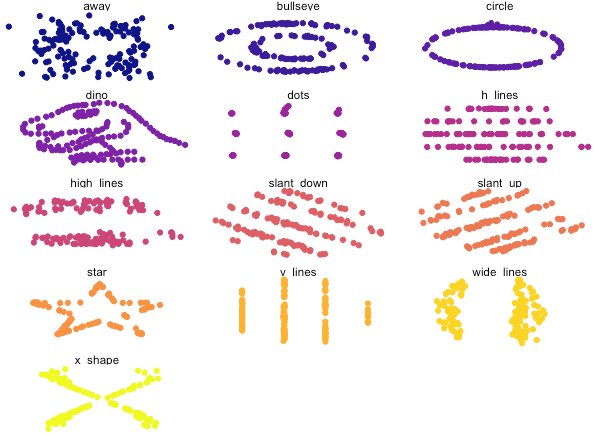
Despite having similar statistical characteristics, the shape of the data was different between datasets (and now you probably understand why this package is called "datasauraus", if you look carefully).
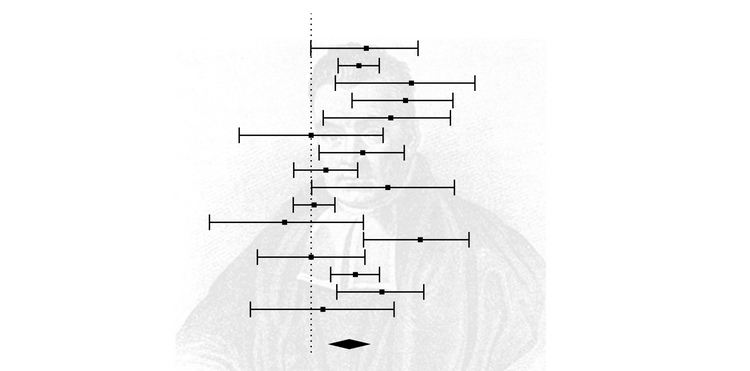
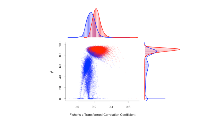
Meta-analysis is no different. Typically, a meta-analyst will construct a forest plot to visualise effect sizes and their variances, which are used to synthesize data into a summary effect size. Here's an example meta-analysis and forest plot and the code to construct it, using a dataset from metafor and a meta-analysis and forest plot function from the meta package.
library(meta)
library(metafor)

dat <- dat.molloy2014

datcor <-   metacor(ri,
                    ni,
                    data = dat,
                    studlab = paste(authors),
                    method.tau = "REML",
                    comb.random = TRUE,
                    comb.fixed = FALSE,
                    sm = "ZCOR")

meta::forest(datcor, print.I2 = FALSE)

datcor

## OUTPUT WITH SOME INFO OMITTED ##

Number of studies combined: k = 16

                        COR           95%-CI    z  p-value
Random effects model 0.1488 [0.0878; 0.2087] 4.75 < 0.0001

Quantifying heterogeneity:
 tau^2 = 0.0081 [0.0017; 0.0378]; tau = 0.0901 [0.0412; 0.1944]
 I^2 = 60.7% [32.1%; 77.2%]; H = 1.59 [1.21; 2.10]

Test of heterogeneity:
     Q d.f. p-value
 38.16   15  0.0009
Looking at the results of the meta-analysis, the random-effects model was statistically significant (p < .0001), with a summary effect size estimate of 0.1488. The test of heterogeneity was also statistically significant (p < .0009).
Now let's look at our forest plot. Of course, this is very subjective, but forest plots can identify studies that are worth closer inspection.
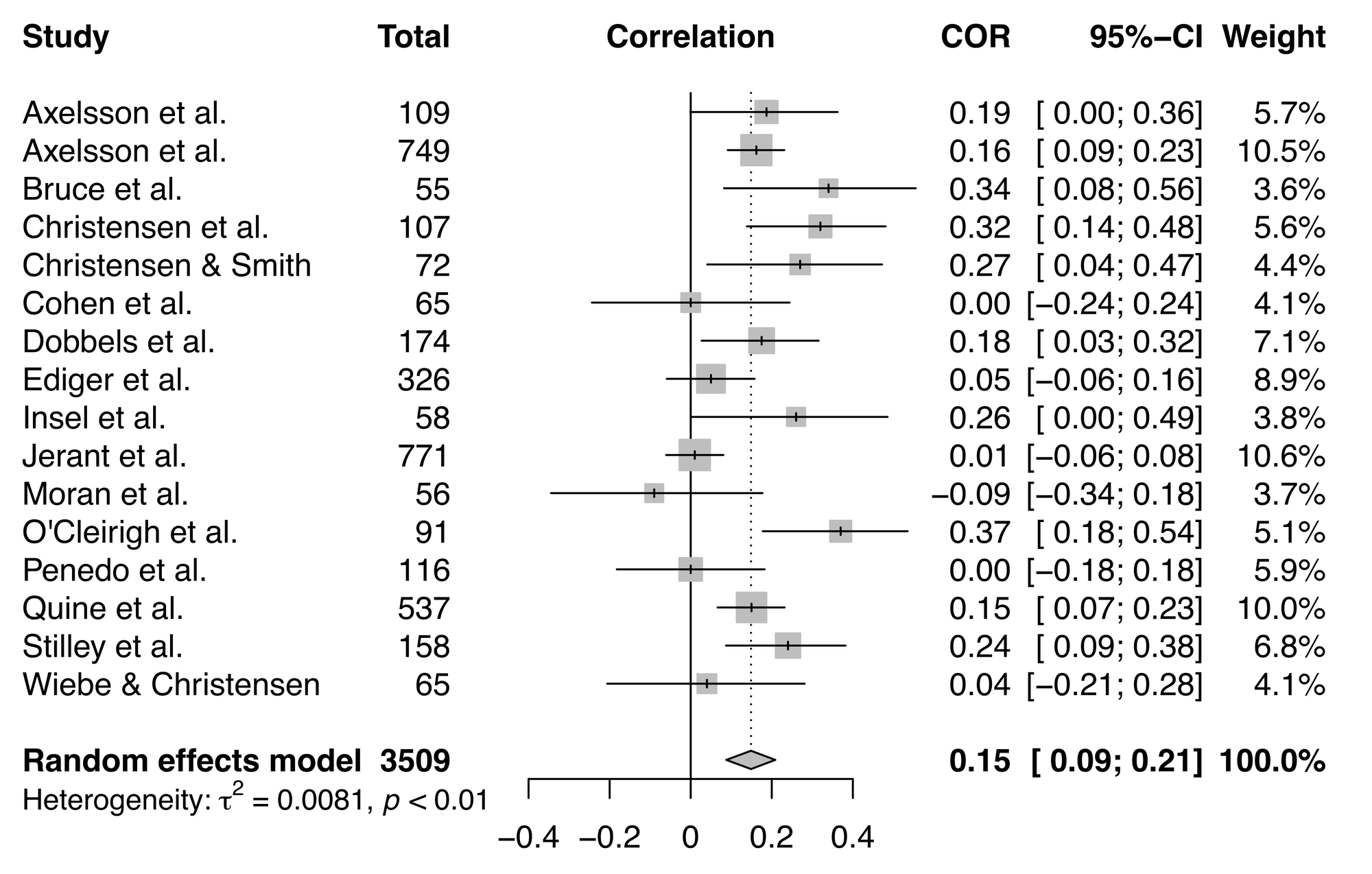
On first glance, there aren't any studies that stand out in this meta-analysis, but it's always worth taking a more in-depth look at possible outliers and influential studies.
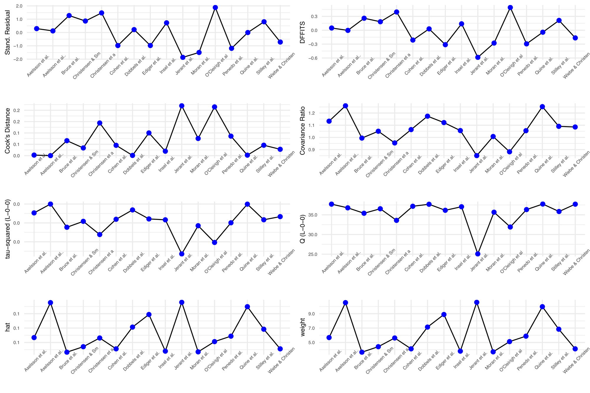
One approach for outlier detection is a "leave-one-out" analysis, which assesses the influence of individual studies by performing a series of meta-analyses that leave out one of the studies in the original meta-analysis. The general concept with this analysis is that by removing one study, you can observe how much the results change, thus demonstrating the effect of the inclusion of that particular study on your results.
It's worth noting that none of these tests within a leave-one-out analysis is a definitive test, as you're arbitrarily excluding one study per analysis that would ordinarily meet your inclusion criteria. So if your primary meta-analysis was not statistically significant but one of your leave-one-out meta-analyses were significant, you can't make big claims regarding the significance of your finding. Instead, consider this approach a sensitivity test.
Leave-one-out analysis can also help identify sources of heterogeneity. Perhaps there are two studies that seem to be influential—what is it about those studies that make them influential? Maybe they include participants from the same kind of population? Sometimes these factors don't become clear until you see these studies grouped together via leave-one-out analysis.
It's straightforward to perform a leave-one-out analysis using the metafor R package. The influence()function contains a suite of leave-one-out diagnostic tests, summarised in Viechtbauer & Cheung (2010), that you can run to help identify influential studies.
library(metafor)

dat <- dat.molloy2014

dat <- escalc(measure="ZCOR",
              ri=ri, ni=ni,
              data=dat.molloy2014,
              slab=paste(authors, year, sep=", "))

res <- rma(yi, vi, data=dat)
inf <- influence(res)
inf

# OUTPUT #

                          rstudent  dffits cook.d  cov.r
Axelsson et al., 2009       0.2918  0.0485 0.0025 1.1331
Axelsson et al., 2011       0.1196 -0.0031 0.0000 1.2595
Bruce et al., 2010          1.2740  0.2595 0.0660 0.9942
Christensen et al., 1999    1.4711  0.3946 0.1439 0.9544
Christensen & Smith, 1995   0.8622  0.1838 0.0339 1.0505
Cohen et al., 2004         -0.9795 -0.2121 0.0455 1.0639
Dobbels et al., 2005        0.2177  0.0296 0.0010 1.1740
Ediger et al., 2007        -0.9774 -0.3120 0.1001 1.1215
Insel et al., 2006          0.7264  0.1392 0.0195 1.0561
Jerant et al., 2011        -1.8667 -0.5861 0.2198 0.8502
Moran et al., 1997         -1.4985 -0.2771 0.0756 1.0073
O'Cleirigh et al., 2007     1.8776  0.4918 0.2148 0.8819
Penedo et al., 2003        -1.1892 -0.2939 0.0859 1.0550
Quine et al., 2012         -0.0020 -0.0423 0.0021 1.2524
Stilley et al., 2004        0.8066  0.2126 0.0459 1.0907
Wiebe & Christensen, 1997  -0.7160 -0.1656 0.0280 1.0853
                          tau2.del  QE.del    hat  weight
Axelsson et al., 2009       0.0091 37.7109 0.0568  5.6776
Axelsson et al., 2011       0.0100 36.7672 0.1054 10.5396
Bruce et al., 2010          0.0075 35.3930 0.0364  3.6432
Christensen et al., 1999    0.0068 33.5886 0.0562  5.6195
Christensen & Smith, 1995   0.0082 36.5396 0.0441  4.4069
Cohen et al., 2004          0.0084 37.1703 0.0411  4.1094
Dobbels et al., 2005        0.0094 37.6797 0.0714  7.1362
Ediger et al., 2007         0.0084 36.1484 0.0889  8.8886
Insel et al., 2006          0.0083 37.0495 0.0379  3.7886
Jerant et al., 2011         0.0047 25.0661 0.1058 10.5826
Moran et al., 1997          0.0077 35.6617 0.0369  3.6922
O'Cleirigh et al., 2007     0.0059 31.9021 0.0511  5.1150
Penedo et al., 2003         0.0080 36.3291 0.0587  5.8732
Quine et al., 2012          0.0100 37.7339 0.0998  9.9778
Stilley et al., 2004        0.0083 35.8385 0.0684  6.8403
Wiebe & Christensen, 1997   0.0087 37.7017 0.0411  4.1094
                             dfbs inf
Axelsson et al., 2009      0.0481
Axelsson et al., 2011     -0.0032
Bruce et al., 2010         0.2623
Christensen et al., 1999   0.3994
Christensen & Smith, 1995  0.1837
Cohen et al., 2004        -0.2112
Dobbels et al., 2005       0.0296
Ediger et al., 2007       -0.3128
Insel et al., 2006         0.1387
Jerant et al., 2011       -0.5430
Moran et al., 1997        -0.2791
O'Cleirigh et al., 2007    0.5059
Penedo et al., 2003       -0.2941
Quine et al., 2012        -0.0434
Stilley et al., 2004       0.2125
Wiebe & Christensen, 1997 -0.1642
This analysis also provides a classification for what's considered influential. Look for an asterisk in the last column of the output, called 'inf' (this particular analysis had no influential studies, so there are no asterisks here). See the metafor documentation for what's considered influential, but here's an important point from this document worth emphasising:
Note that the chosen cut-offs are (somewhat) arbitrary. Substantively informed judgment should always be used when examining the influence of each study on the results.
You can also make the same plot (with slightly different names for the influence tests) using the dmetar package:
library(devtolls)
devtools::install_github("MathiasHarrer/dmetar")
library(dmetar)

inf.analysis <- InfluenceAnalysis(x = datcor, random = TRUE)

plot(inf.analysis, "influence")
If you want a nice visualisation for your leave-one-out analysis, you can pair the 'meta' and 'dmetar' packages:
library(dmetar)
library(meta)
library(metafor)

dat <- dat.molloy2014

datcor <-   metacor(ri,
                    ni,
                    data = dat,
                    studlab = paste(authors),
                    method.tau = "REML",
                    comb.random = TRUE,
                    comb.fixed = FALSE,
                    sm = "ZCOR")

inf.analysis <- InfluenceAnalysis(x = datcor,
                                 random = TRUE)

plot(inf.analysis, "es")
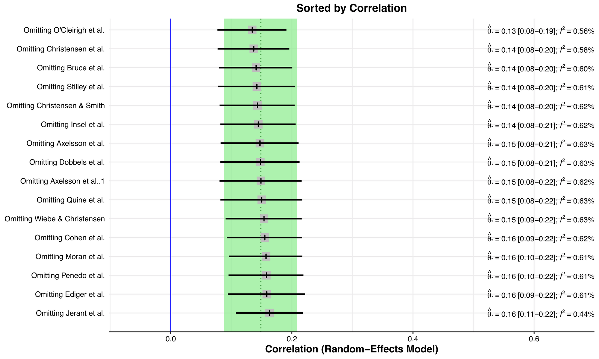
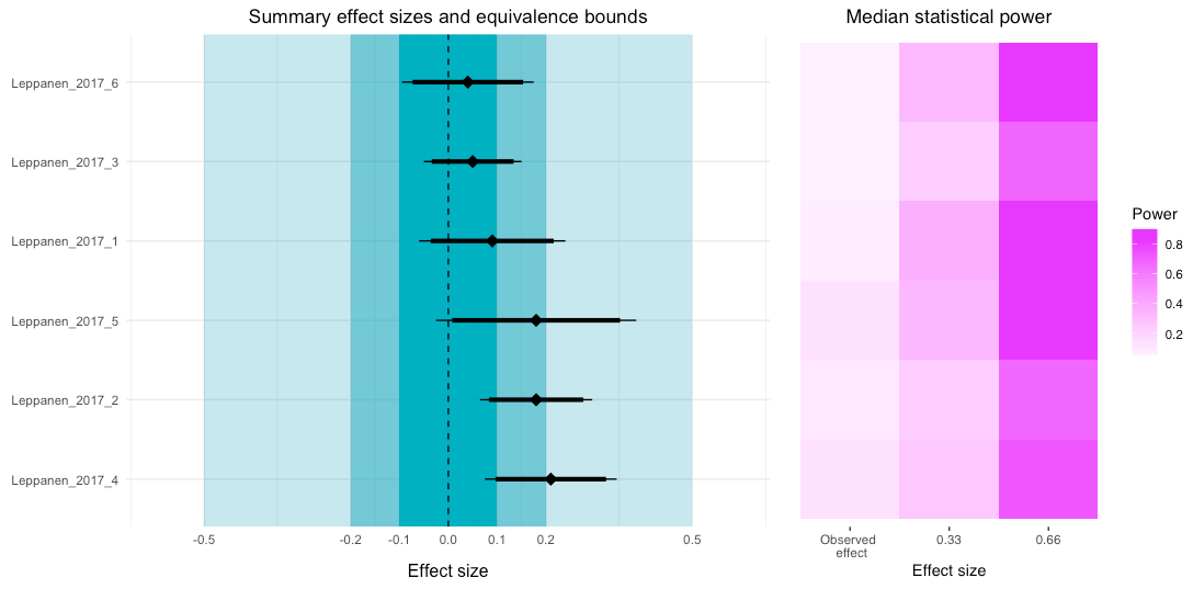
This plot is like a forest plot, but instead of visualising the effect size and variance for each study in each row, it visualises the summary effect sizes for meta-analyses without the study named in each row. The original summary effect size (including all studies) is shown as a dotted vertical line, and the 95% confidence interval of the original meta-analysis is shown by the green bounds. In this example, there isn't a big shift between the smallest correlation at the top and the largest correlation at the bottom.
Outliers just based on effect size are easier to eyeball from a forest plot, however, an outlier of heterogeneity is a little tricker to identify.
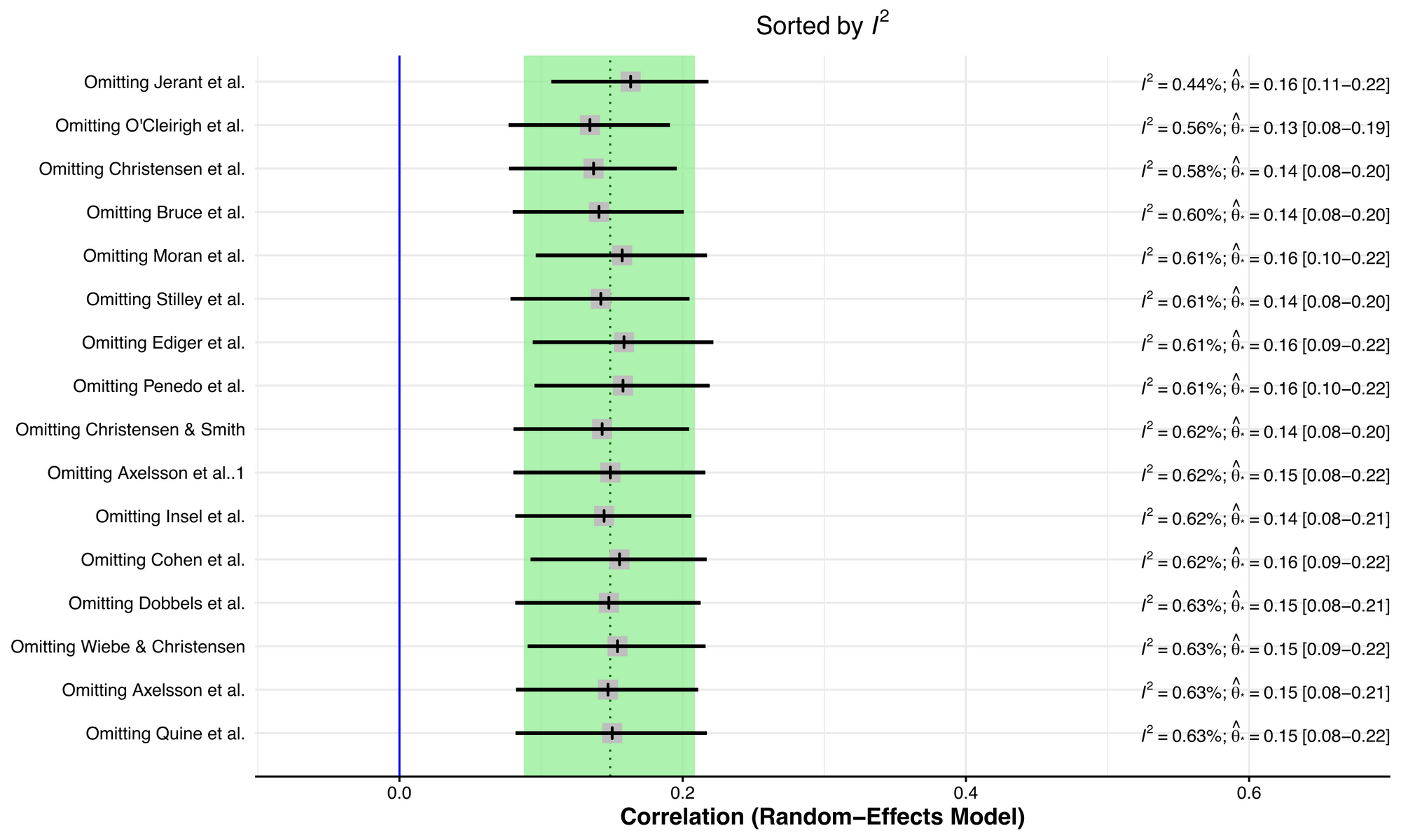
To better understand studies that are influential in terms of heterogeneity, you can also order the plot via I2, which is one measure of heterogeneity. While a single study effect size may not have a large influence on the summary effect size, it could have an impact on heterogeneity.
plot(inf.analysis, "I2")
Removing the Jerant et al study seems to have an appreciable effect on reducing study heterogeneity. To more closely explore this, we can construct a Baujat plot, which shows the overall heterogeneity contribution for each study against the influence on the pooled result for each study.
plot(inf.analysis, "baujat")
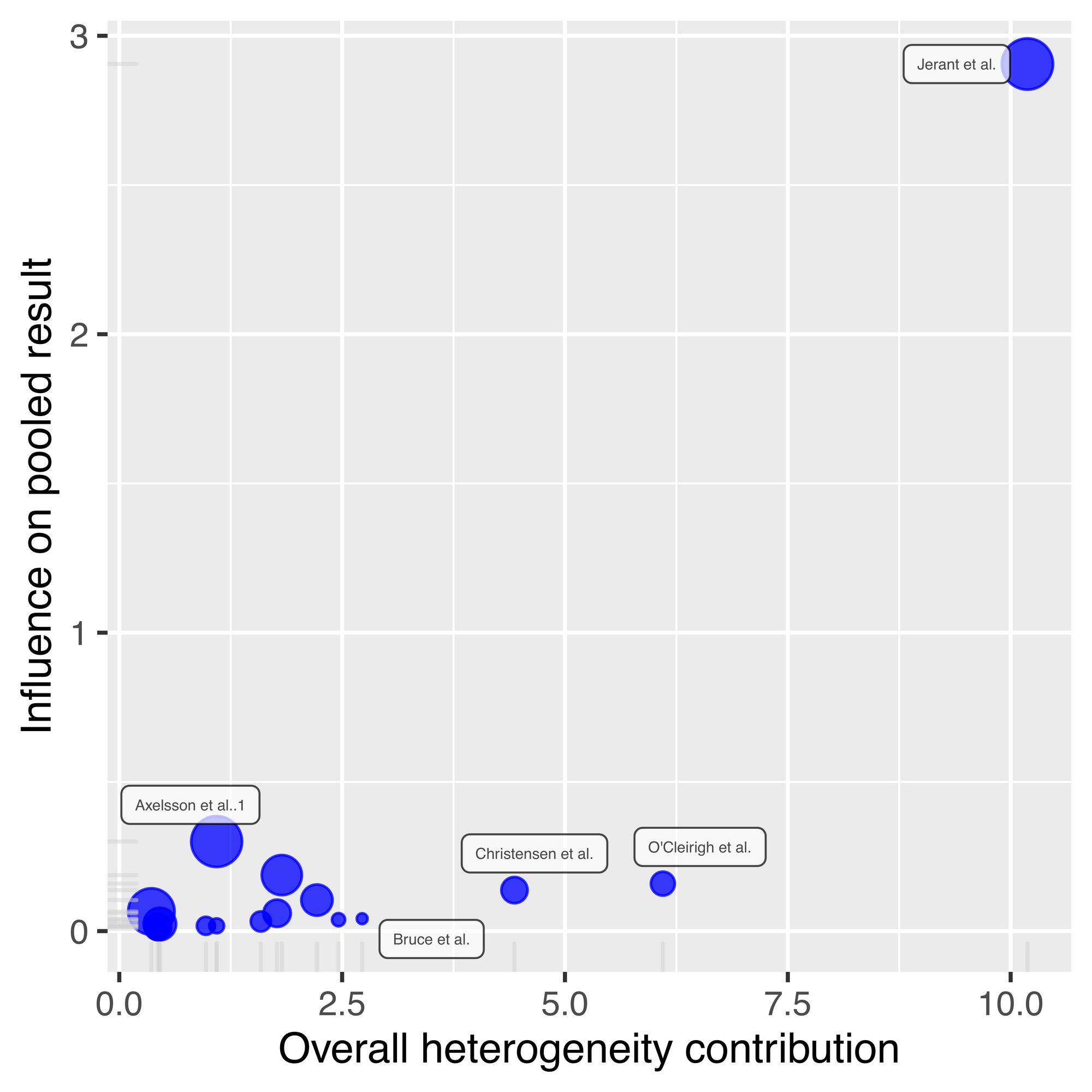
Jerant et al is really sticking out now, as it has almost three times more influence on the pooled result compared to all other studies, and a comparatively high overall heterogeneity contribution. If we look back at our leave-one-out plot ordered by correlation, removing Jerant et al leads to the largest effect size, but it's not the largest by much. This indicates that this Jerant et al is pulling down the overall summary effect size estimate, but not by a large amount.
What do you do if your analysis identifies potential outlier studies?
I don't think that outliers shouldn't be removed from your primary analysis, unless they're implausible.
What do I mean by implausible?
To give a recent example, a man in the UK was put into the priority list for a COVID vaccine due to morbid obesity. Thinking that this may have been a mistake, as he considered his weight to be relatively normal, he followed this up to discover that the local authorities had him registered with a BMI of 28,000, because his height of 6ft 2ins was noted as 6.2cm instead. As BMI of 40 and over is considered 'morbidly obese', a BMI value of 28,000 is obviously implausible.
Leave-one-out analyses are better framed as robustness checks and as a way to identify sources of study heterogeneity that you may have missed otherwise. You've set your inclusion/exclusion criteria for your meta-analysis for a reason, so if a study fulfills criteria, then it should be included.
Outlier analyses are also a good check to make sure that you have entered numbers correctly. A common reason for mistakes in meta-analysis is that standard error and standard deviation get mixed up. Of course, this should be carefully checked for all studies, but outlier analysis is a good backstop, just in case.
It's worthwhile reporting your leave-one-out analysis, regardless of whether you discover outliers. If your result hangs on the inclusion of a single study, then your findings aren't terribly robust and this should be made clear in the discussion of your results.